Chandeliers in the living room are a great feature because they both light up the room and add to its style. You may find it hard to choose one for your living room, though, because there are so many types, sizes, lighting options, and other components to consider. That’s why we put together a list of some of our favorite living room lights and a guide on how to style them in different kinds of homes.
Masterful Monochrome
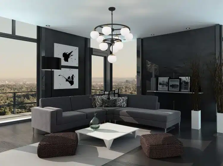
When black and white are used on purpose in different shades, textures, and mediums, places that are mostly black and white are anything but dull. Adding this chandelier not only goes with the color plan better, but it also gives those colors a new look and texture. No matter what color scheme your living room has, use the shape, material, or other design features of your light to add to that scheme.
Unconventional Design
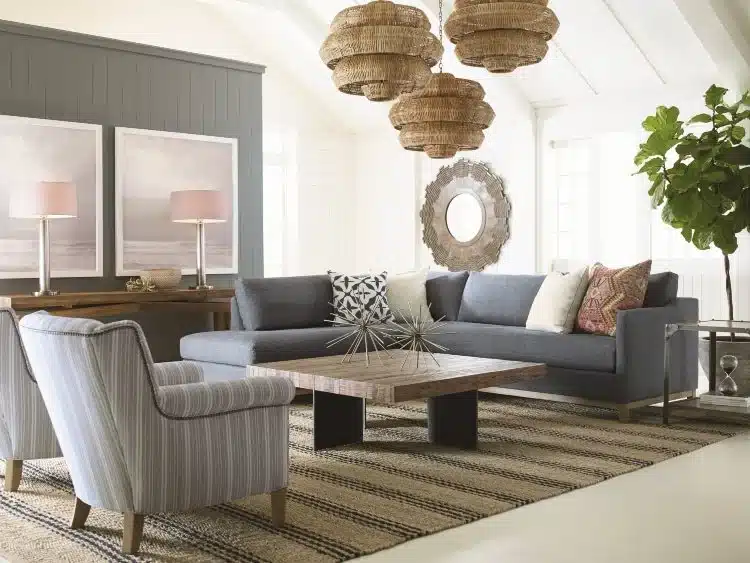
If you can use more than one light, you can make a beautiful focus point. It is common to see a single chandelier in the middle of a room. You can make your living room’s center point more interesting by moving and changing the heights of the chandeliers.
Bold Styles
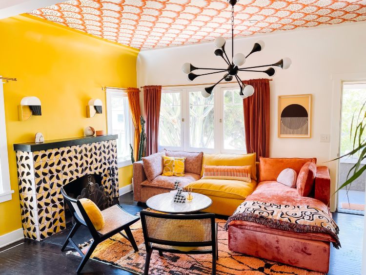
Most homes don’t put wallpaper on the ceiling, but when they do, it makes for some interesting styles. If you want to put a Sputnik chandelier with a textured or wallpapered ceiling, look for lights that go with that style. The round bulbs in this room match the round scallops on the ceiling wallpaper and the colors used in other parts of the living room to make a beautifully planned space.
Mixed Metals
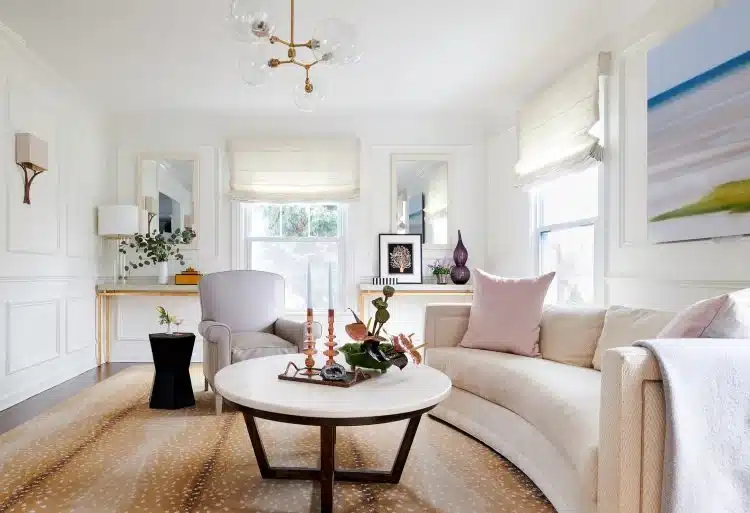
A lot of living rooms have more than one type of light or lighting in each area. There is a chandelier, a wall light, a table lamp, and two tall candles in this room. All of the lights work together even though they have different silver finishes. This is because the finishes are all close in color and tone. You can use different light fixtures to make a room that flows well and is full of life as long as they all have the same tone.
Complementary Design
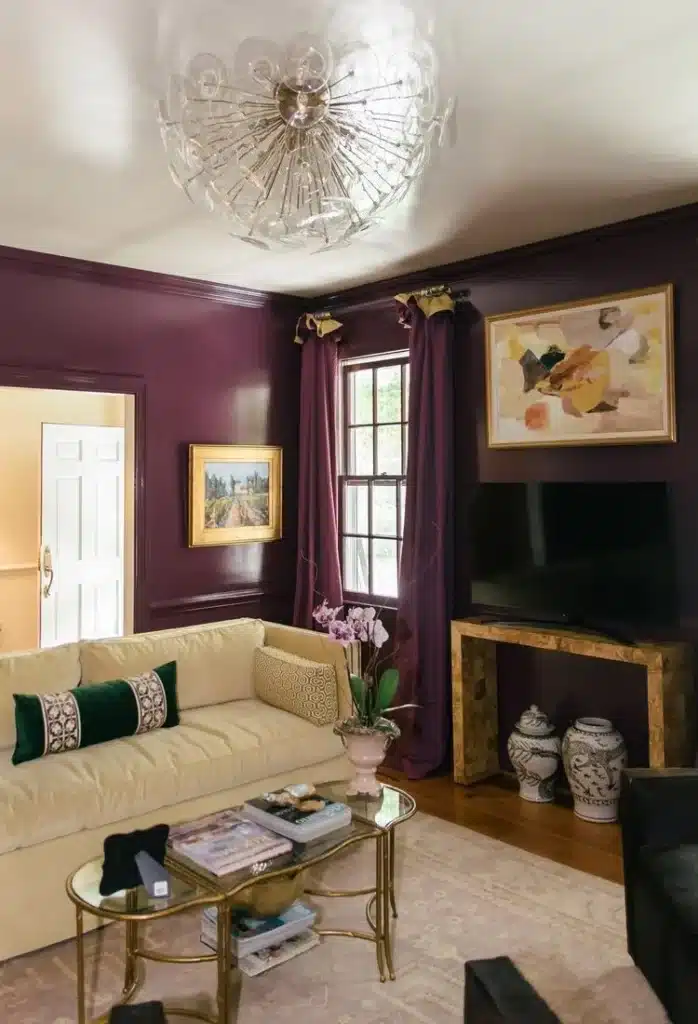
Beautifully decorated ceilings like this one are perfect for making living rooms look classy and expensive. Since the ceiling looks like a soft, round circle, it makes sense that the chandelier has round lines all over it. Whether your ceiling looks like this or not, the shapes, textures, and tones of your chandelier can match your ceiling or any other architectural feature nearby.
Elegance
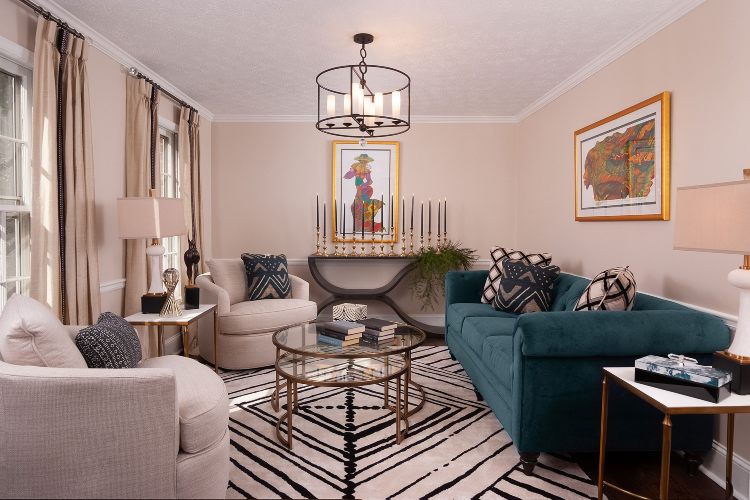
There are some colors and materials that just scream luxury. Three of these elements are gold, glass, and crystal. The light in this grand sitting room shows off gold and glass. Even though the light itself has a modern, stylish look, the gold accents in other parts of the room make it look good with the light. Using stylish materials on purpose can improve the design of the whole room, especially when they are put together in a fancy chandelier.
Dimensional Design
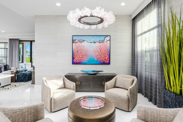
The furniture and decorations in this living room don’t add much texture or depth. In modern minimalist living rooms, you can pick a chandelier that fits in with the clean lines or a bold pendant that gives the room more depth.
Opposites

Candles look great in chandeliers and as home decor in general. You can match the candles in your chandelier to candles in other parts of the room, but using candles of different colors can also look beautiful. The candles in this chandelier are clean whites or creams, and the frame is black. The candles in the back of the room, on the other hand, are black. This twist on what people expect lets each light display shine as a separate accent while still fitting in with the overall theme.
Furthering The Focal Point
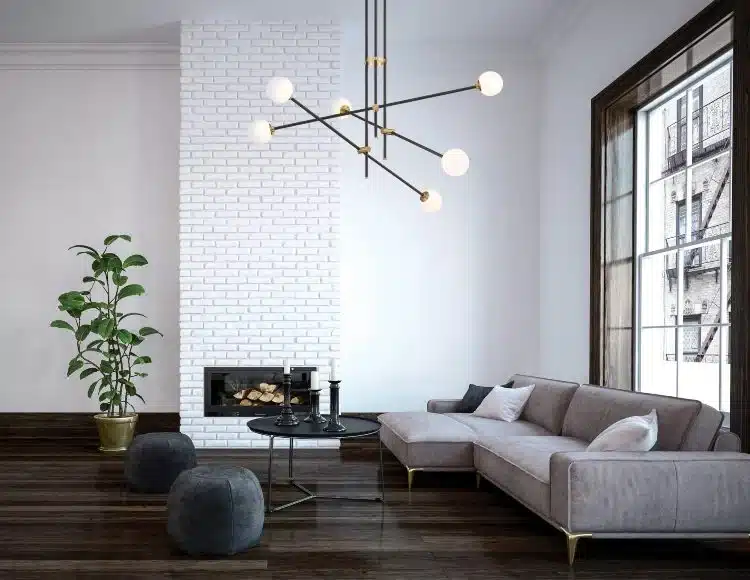
The back wall of this lovely living room with its windows and fireplace is the clear focal point. But the chandelier, which sits perfectly in the upper third of the fireplace, also becomes a part of that focal point. Even though a beautiful piece of art would look great on the fireplace, leaving it out lets the light be the star. If you want to put a chandelier in your living room, think about the space behind it and how the chandelier can stand out as a work of art.
Positioning
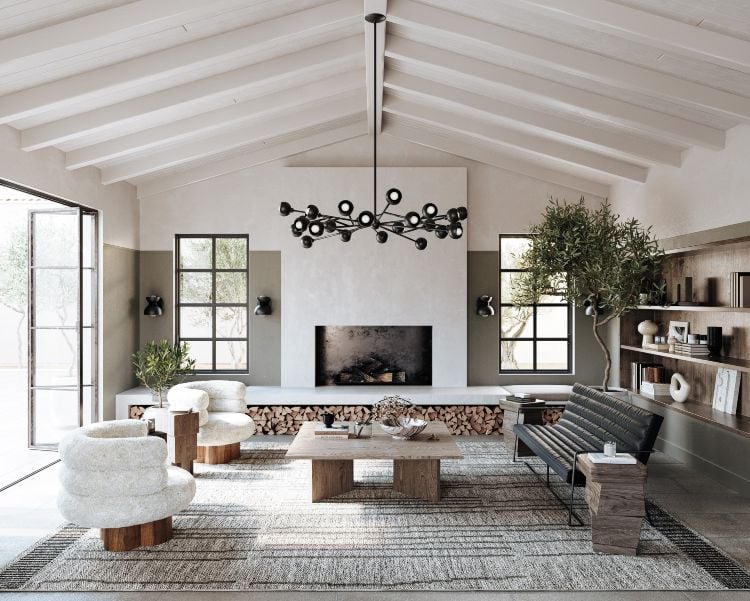
In the last picture, the chandelier was perfectly lined up with the fireplace behind it. However, that arrangement doesn’t work in all living rooms. Even if the light doesn’t line up perfectly with the fireplace or other key pieces of architecture, this modern living room still looks lovely. Do not give up if your living room does not have the exact plan or design of other model living rooms. There are many acceptable ways to place chandeliers to make the most of your room.
Reflective Design
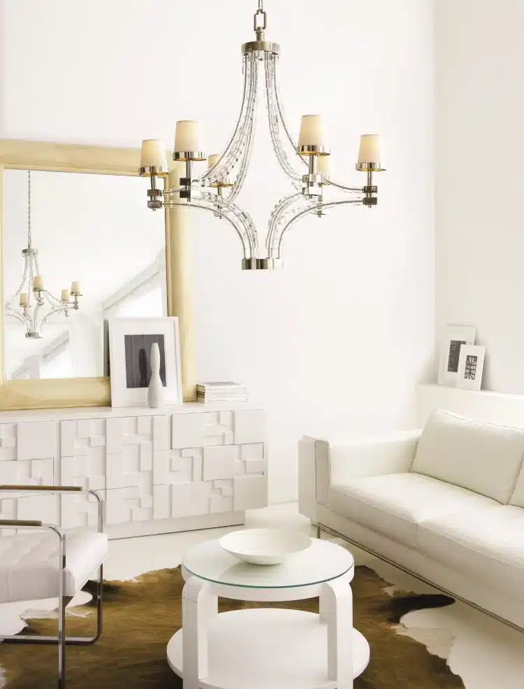
If you have chandeliers or hanging lights in your room, putting them next to a mirror is a great way to show off the light in a different way and spread it around the living room. The mirror will not only spread the light over a bigger area, but it will also make the room brighter and make your chandelier stand out more.
Clever Color Schemes
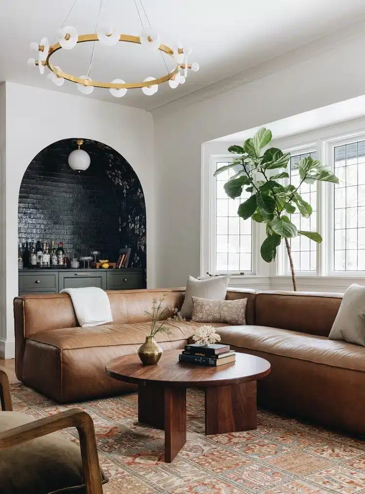
Even if that color doesn’t show up much else in the room, the metal or general finish of your living room light can help it fit in. This light doesn’t have an old brass finish like the main furniture, rug, or wall art, but the warm tones used in those areas are the same. Using warm tones in the room’s lighting and color scheme is important for making the mood in your living room flow together.
Lighting Scheme
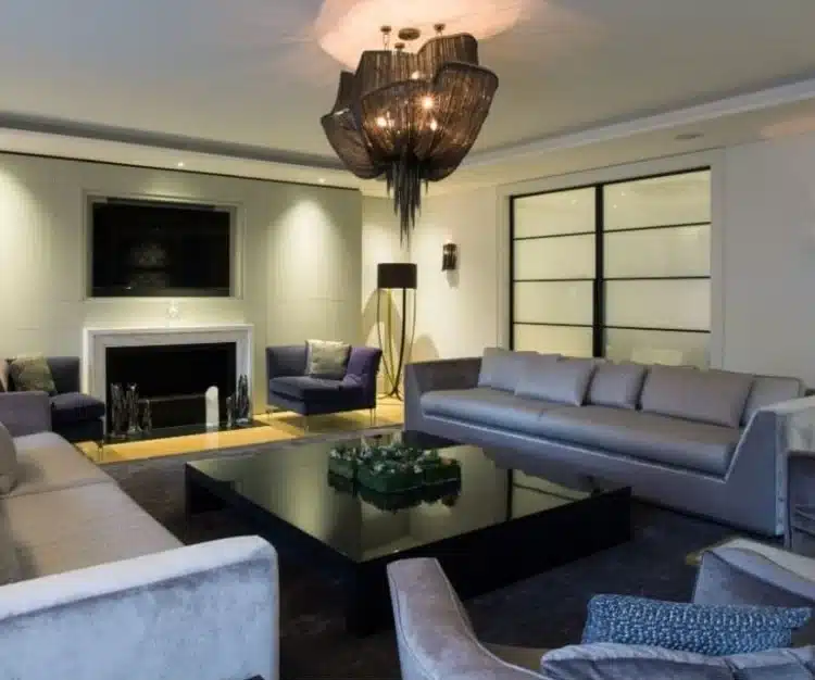
Some chandeliers spread light over a large area, while others use a softer, more focused glow to create their style. If that’s the case with your chandelier, think carefully about what other lights you will use with it to set the mood and get the right amount of light in the room.

